The design 雪花
Tatami's Tokyo Night, made into a system.
A tour of Sekka's brand: the crest and where it comes from, Tatami's colours with their contrast measured, the type, the shapes and spaces the desktop already uses, and what isn't finished. This page is built from the same token file as the brand.
1
The crest
雪華, sekka, is an Edo-period word for snow crystals. In 1832 Doi Toshitsura published eighty-six of them, drawn through a microscope, as Sekka Zusetsu, and the patterns became a fashion in Edo design.
The mark is a yukiwa 雪輪, the snow ring of Japanese family crests: six circles of radius 76, centred 36 from the middle of a 256 grid, joined into a softly scalloped ring. A six-armed crystal is cut through it: arms from radius 19 to 84, one pair of branches on each, and a hollow hexagon at the centre. Arms point straight up.
It is drawn to stay clearly apart from NixOS's lambda snowflake. Sekka runs on NixOS; the two marks are never locked up together.
2
Lockups and sizes
The wordmark is JetBrains Mono ExtraBold, Tatami's own face, outlined so it never depends on installed fonts. Beside it, 雪花 stands vertically like a seal. On this page they take their colours from the theme.
Below 24px the crest loses its branches: the symbolic glyph thickens the cuts so they survive the pixel grid. The app icon sits on a square tile, because every Tatami surface is square.
SVG: lockup, Night · lockup, Day · crest · symbolic · app icon

3
Colour
Night is Tatami's own palette, value for value, from its bar, launcher, notifications, terminal and Displays window. Blue is the one accent: the focused window's border, today in the calendar, links and focus. Status colours always come with a word or an icon.
Day exists for documents and light pages; Tatami itself is dark only. High contrast is a third theme for people who need more: every text colour reaches 7:1 on every surface, and edges reach 3:1. The one colour that fails in Night is kept on purpose: Tatami's week numbers are 2.8:1, so that grey is only ever decoration.
| Token | Night | Day | High contrast |
|---|---|---|---|
surfaceGround of every Tatami surface: windows, bar, launcher, notifications, OSD and lock screen. Every text token is checked against it. High contrast deepens it so text reaches AAA. | #1a1b26ground | #e1e2e7ground | #0b0c12ground |
surface-raisedCards, popovers and thumbnails in Displays. Day lightens instead of darkening, so text keeps its contrast. In High contrast a raised surface is barely lighter, so it always carries a border-inactive edge. | #24283bground | #eef0f5ground | #161925ground |
selectionSelected text in the terminal and selected rows. text-strong, text and text-secondary stay at 4.5:1 or more on it in Night and Day, and 8:1 or more in High contrast. | #292e42ground | #cdd1e2ground | #26304fground |
indigoDyed cloth: the noren in the Genkan icon and other large fields. text-strong reads 4.1:1 on it at night and 6.2:1 in High contrast, so only marks and text 24px or larger go on indigo. | #3d59a1text-strong 4.1:1 · large text only | #3d59a1text-strong 2.6:1 · decorative only | #3d59a1text-strong 6.2:1 · AA, short of AAA |
border-inactiveUnfocused window borders (Hyprland inactive_border). Decorative in Night and Day, under 3:1, so never the only edge of a control there. In High contrast it reaches 3.6:1 on every surface and edges raised surfaces and controls. | #595959aa1.5:1 · decorative | #a1a6c51.6:1 · decorative | #7a85b53.6:1 · meets 3:1 |
text-faintWeek numbers and weekday labels in the bar's calendar. Kept exact from Tatami but only 2.8:1 (Night) and 2.5:1 (Day) on surface: decorative, repeated labels only, never meaning. High contrast lifts it to 7.3:1 or more. | #565f892.2:1 · decorative only | #848cb52.2:1 · decorative only | #b7c0ea7.3:1 · AAA |
text-secondaryNotification body text and other secondary copy, on surface, surface-raised and selection: 4.6:1 or more in Night and Day, 8.1:1 or more in High contrast. | #939aba4.8:1 · AA | #47578f4.6:1 · AA | #c3cbee8.1:1 · AAA |
textDefault foreground in the bar, terminal, launcher and windows, on surface, surface-raised and selection (6.4:1 Night, 4.5:1 Day, 10.2:1 High contrast at the lowest). | #a9b1d66.4:1 · AA | #3156ab4.5:1 · AA | #dde3fb10.2:1 · AAA |
text-strongHeadings, the calendar's month, Displays' text and the wordmark's ink. 8.3:1 or more on every surface in Night and Day, 12:1 or more in High contrast. | #c0caf58.3:1 · AAA | #1a1b2611.2:1 · AAA | #f4f6ff12.0:1 · AAA |
accentThe one accent: the focused window's 2px border, today in the calendar, notification and launcher borders, accent fills, links and focus rings. Text-safe on every surface (5.3:1 Night, 4.5:1 Day, 7.4:1 High contrast at the lowest). | #7aa2f75.3:1 · AA | #1357b54.5:1 · AA | #a9c4ff7.4:1 · AAA |
on-accentText and glyphs on accent fills, such as today's date: 6.8:1 Night, 6.9:1 Day, 11.2:1 High contrast. | #1a1b266.8:1 on accent · AA | #ffffff6.9:1 on accent · AA | #0b0c1211.2:1 on accent · AAA |
crestThe crest's ink: always the accent, so the mark holds 4.5:1 or more on surface, surface-raised, selection and white in Night and Day, and 7.4:1 or more in High contrast. | #7aa2f75.3:1 · meets 3:1 | #1357b54.5:1 · meets 3:1 | #a9c4ff7.4:1 · meets 3:1 |
dangerScreen recording, a Keep Awake request without a verified inhibitor, destructive actions and errors. Always with a word or icon. 7.6:1 or more on every High contrast surface. | #f7768e5.1:1 · AA | #b3083a4.6:1 · AA | #ffb1c07.6:1 · AAA |
successApplied and verified states. Always with a word or icon: never told from danger by hue alone. 9.9:1 or more on every High contrast surface. | #9ece6a7.3:1 · AAA | #49602f4.6:1 · AA | #c2ef8e9.9:1 · AAA |
warningPending and caution states. Always with a word or icon. 8.8:1 or more on every High contrast surface. | #e0af686.7:1 · AA | #7056314.5:1 · AA | #f8cf8c8.8:1 · AAA |
purpleTerminal magenta and btop graphs. Data only, not interface chrome. 8:1 or more on every High contrast surface. | #ad8ee65.0:1 · AA | #7317ec4.5:1 · AA | #d5c2ff8.0:1 · AAA |
tealTerminal cyan and btop graphs. Data only, not interface chrome. 8.4:1 or more on every High contrast surface. | #449dab4.3:1 · large text only | #0c65544.6:1 · AA | #8fdde98.5:1 · AAA |
4
Type
JetBrains Mono is the desktop's voice: the bar, the menu, the terminal and the wordmark. Kanji are set in Noto Serif JP, the brush-like mincho beside the mono's straight lines; on this site they are drawn as outlines, so nobody downloads a font for a handful of characters.
Long reading, like this, is set in Atkinson Hyperlegible Next, which the Braille Institute designed for low-vision readers. Inside the desktop, notifications use Liberation Sans. Every font here is served by this site.
sekka
Welcome to Sekka
雪花
玄関 · 畳 · 雪見
sekka-update --status
Restart to finish updating
Why you shouldn't use Sekka (yet)
Tatami: a desktop under your fingertips
Choose your disk, account, desktop, applications, and location.
Current interface in preview mode, with sample data.
5
Shape and space
Corners are square everywhere; the crest is the one round thing. Borders are 2px: blue for the focused window, notifications and the launcher, a muted grey for windows in the background. Windows are 5px apart and 10px from the edge of the screen. Nothing casts a shadow.
This site is laid out the same way. Each block is a window; the one in blue has focus. The home page's sections sit like the mats of a four-and-a-half-mat room, where no four corners ever meet.
gap-inspacing5pxBetween tiled windows (Hyprland gaps_in).bar-edgespacing8pxWaybar's left and right margins.notify-gapspacing8pxBetween stacked notifications.gap-outspacing10pxBetween tiled windows and the screen edge (Hyprland gaps_out).card-pad-yspacing10pxTop and bottom padding inside a notification.card-pad-xspacing12pxLeft and right padding inside a notification.dialog-padspacing18pxPadding inside the launcher's menus.radius-noneradius0Every Tatami surface: windows (Hyprland rounding 0), notifications, launcher, OSD and app tiles. The crest is the only round form.bar-heightsize26pxWaybar's height.workspace-slotsize20pxWidth of each workspace button in the bar.indicator-slotsize21pxWidth of the recording, night-light, silence and Keep Awake indicators.icon-slotsize27pxWidth of each tray and status icon slot.card-widthsize380pxNotification width.border-widthborder2pxWindow, notification, launcher and focus borders.
6
The family
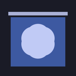
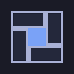
Genkan's icon is a noren, the split curtain that hangs in a Japanese entrance, dyed indigo with the crest across its slits as real cloth would have it. Tatami's is a four-and-a-half-mat room that also reads as tiled windows. Both are proposals; neither ships yet.
Yukimi's icon is the one it ships today: a round window onto a snowy night. It still uses NixOS blues and a cream frame, so it doesn't belong to this family yet.

7
What isn't finished
- The desktop doesn't use the crest yet. Tatami's bar shows the NixOS logo and Genkan's welcome page shows the NixOS snowflake.
- Genkan and Yukimi are still light libadwaita with NixOS blues, not Tokyo Night, and Yukimi's icon is outside the family.
- Tatami is dark only. Day and High contrast exist in the tokens and on this site, not in the desktop.
- The week-number grey fails contrast in Night and Day, kept because it is Tatami's real value and only decorative.
- Pages share no raster image, so links posted elsewhere show no picture.